
This is the second part of the “Behind the Screen” blog series, where I share my experience and lessons learned while building sveltevietnam.dev. You can read the first part here (not a prerequisite for this post).
Today, dark mode is becoming a common and even necessary feature to provide a complete user experience. Although the problem seems simple on the surface, it does require meticulous work and a combination of many small details from many different technologies. This blog post discusses one of many possible implementations of dark mode with Svelte and SvelteKit. Most of the details, however, are framework-agnostic, you can apply them to any framework and front-end project.
Dark Mode with CSS
First, we look at the simplest strategy to implement a dark mode with CSS Custom Properties. Let’s take an example where we have set up a system like this:
:root {
  --color-bg: white;
  --color-fg: black;
}

html {
  background-color: var(--color-bg);
  color: var(--color-fg);
}
Notice that :root is actually just html, we use it here as a general convention for a place to declare global CSS variables. When changing the value of the --color-* variables, the interface will automatically update accordingly.
Imagine now we have a magical At-rule called @dark that can activate the declarations inside when dark mode is turned on:
:root {
  --color-bg: white;
  --color-fg: black;

  @dark {
    --color-fg: black;
    --color-bg: white;
  }
}
In the above CSS, the default mode is light. When @dark is active, we change the value of the corresponding CSS variables to express dark mode. If we could do this, we would have completed more than half of the work. Unfortunately, CSS does not support this magical syntax. But don’t worry: in the following sections, we will try to simulate the @dark feature.
When Is It Dark?
When does dark mode take effect? Many applications will allow users to choose between light and dark modes in some settings. However, if the user has just visited the application for the first time, is it light or dark?
The answer is that we need to look into the operating system (OS) settings with the help of the CSS media query prefers-color-scheme:
@media (prefers-color-scheme: dark) {
  /* CSS setup for dark mode */
}

@media (prefers-color-scheme: light) {
  /* CSS setup for light mode */
}
So, there are four possible situations:
- User has not selected any mode and the default mode of the operating system is
light - User has not selected any mode and the default mode of the operating system is
dark - User has explicitly selected
lightmode - User has explicitly selected
darkmode
As a result, our magical @dark needs to handle (2) and (4); (2) is OS settings, and (4) is user preference.
User Preference
For (4), we need to setup additional HTML that can express user experience and is selectable via CSS selectors. There are a couple of ways to do this, most commonly with class name or attribute. Here is what we will do in this blog post:
<html data-color-scheme="dark">
  <!-- application content -->
</html>
The value of data-color-scheme is dark, light, or system. system means that situation (2) will take effect. We will discuss how to use JS for event handling and mode switching later. With this setup, we can adjust the CSS as follows:
:root[data-color-scheme="dark"] {
  /* corresponding setup */
}OS Settings
For (2), we almost took care of it with prefers-color-scheme as seen above. However, if we stop at that, the user may be locked in one mode unless they manually change the OS settings.
@media (prefers-color-scheme: dark) {
  :root {
    /* ... */
  }
}
For example, a user has selected light in the application settings but the OS is dark, the above CSS will still take effect, because prefers-color-scheme is still dark. To be more precise, we need to negate such case:
@media (prefers-color-scheme: dark) {
  :root:not([data-color-scheme="light"]) {
    /* ... */
  }
}
This means: if the default mode of the OS is dark and the user has not explicitly chosen light, then apply this CSS.
Finally, we are ready to rewrite the CSS in the previous section and replace @dark:
/* light */
:root {
  --color-bg: white;
  --color-fg: black;
}

/* dark, as in (2) */
@media (prefers-color-scheme: dark) {
  :root:not([data-color-scheme="light"]) {
    --color-bg: black;
    --color-fg: white;
  }
}

/* dark, as in (4) */
:root[data-color-scheme="dark"] {
  --color-bg: black;
  --color-fg: white;
}

html {
  background-color: var(--color-bg);
  color: var(--color-fg);
}A Magical PostCSS Plugin
I can hear you say “That is very complicated!“. Yes, it will be super inconvenient if we need to memorize and be this verbose each time we apply some CSS rules for dark mode. For example, imagine we want to change the style of an element with class .box:
.box {
  background-color: blue;
}

/* dark, as in (2) */
@media (prefers-color-scheme: dark) {
  :root:not([data-color-scheme="light"]) .box {
    background-color: red;
  }
}

/* dark, as in (4) */
:root[data-color-scheme="dark"] .box {
  background-color: red;
}
That is such a headache. Fortunately, I have abstracted this into a PostCSS plugin called postcss-color-scheme, providing the @dark syntax itself:
.box {
  background-color: blue;

  @dark {
    background-color: red;
  }
}
Much more concise yeah? I will not discuss this plugin in details here, you can read more at the project’s github. In short it will convert @dark into the verbose version we have already seen. This plugin also provides the @light syntax if you need that.
CSS for Dark Mode in Svelte Component
After using Svelte for a while, you will know that CSS in Svelte is “component-scoped” and the Svelte compiler will automatically purge CSS code that does not match any HTML in the current component. Say, for example, we have the following Svelte component:
<div class="box" />

<style>
  .box {
    background-color: blue;
  }

  .something-else {
    color: blue;
  }
</style>
Svelte will add a hash to the class .box, making it into something like .box.s-SeNnWx1nPv6T. Additionally, .something-else will be removed because there is no element with the class .something-else in this component. If we want to keep .something-else, the :global syntax is necessary.
:global(.something-else) {
  color: blue;
}
When we setup dark mode (regardless of using @dark or not), we will encounter this situation, because html or :root does not exist locally in the component. In that case, remember to add :global. Or if using postcss-color-scheme, just add the global modifier like this:
.box {
  background-color: blue;

  @dark global {
    background-color: red;
  }
}Extra Credit: Dark Mode with TailwindCSS
This section is not essential; it discusses setup with TailwindCSS to improve developer productivity. If you do not use TailwindCSS or are not interested, feel free to skip to the next section.
It will be convenient if we can use the following syntax:
<div class="bg-blue-500 dark:bg-red-500 light:text-gray-500" />dark: and light: are called variant in Tailwind. The postcss-color-scheme plugin adds to your Tailwind config and make these two variants available.
/** @type {import("tailwindcss").Config } */
module.exports = {
  // your config ...
  darkMode: '',
  plugins: [require('postcss-color-scheme/tailwind')],
};
Read more about this setup at github. Additionally, we can add the CSS variables to Tailwind’s color config:
/** @type {import("tailwindcss").Config } */
module.exports = {
  // your config ...
  darkMode: '',
  plugins: [require('postcss-color-scheme/tailwind')],
  theme: {
    extend: {
      colors: {
        fg: 'var(--color-fg)',
        bg: 'var(--color-bg)',
      },
    },
  },
};
and use them as follows:
<!-- in markup -->
<div class="text-fg bg-bg" />

<!-- in css -->
<style>
  div {
    color: theme('colors.fg.DEFAULT');
    background-color: theme('colors.bg.DEFAULT');
  }
</style>Mode switching with JS
To let user switch between the two display modes, we can capture an event from some button or input and use the following JS snippet:
/**
 * @param {'dark' | 'light' | 'system'} scheme
 */
function changeColorScheme(scheme) {
  document.documentElement.dataset.colorScheme = scheme;
}
Note that if you are using SvelteKit SSR feature, the code above can only be run on the client because it references document.
Nowadays, with the CSS :has feature, we can simplify the solution above and do not even have to use JS:
<input id="is-dark" />

<style>
  :root:has(#is-dark:checked) {
    /* corresponding setup */
  }
</style>
Not relying on Javascript means our application is more accessible. sveltevietnam.dev was developed before :has was widely supported, so it could not take advantage of this feature. I will definitely experiment and improve this in the future.
Caching User Preference with Cookie and SvelteKit
The most common method to store the current display mode is to use web storage such as localStorage or sessionStorage. However, JS needs to be loaded before we can access web storage, which results in a common flash-of-content issue because the UI first renders in its default mode then updated to the correct settings only after they are read by JS. We can work around this by blocking the application from rendering until JS is loaded, but this also degrades user experience, and worse, the application will not work if a user cannot access JS (which happens more often than we think, read more here).
A workaround for this workaround is to work around once more: you can technically have a blocking script tag (vanilla JS) that does the necessary logics to initiate the correct display mode. In SvelteKit this script tag would typically be placed in app.html before any app markup. I will let you be the judge of whether this is a good idea or not.
If our application is static or an SPA, there is no other choice (as far as I know). But if we have a server, we can do much better with cookie. Cookie can be read by both client and server, which helps us set the correct value for data-color-scheme in the initial HTML response. Let’s go through each step.
Setup on the Client
Firstly, we add PUBLIC_COOKIE_COLOR_SCHEME to .env to set a public environment variable that can be accessed from both client and server (read more about environment variables here):
# .env
PUBLIC_COOKIE_COLOR_SCHEME=color-scheme
We use this variable to store the name of the cookie. We can alternatively use the hard-coded string color-scheme but it is a convention to store the cookie name in an environment variable, which allows us to be flexible depending on the environment without having to change the source code.
Next, we use the document.cookie API to set the cookie from the client. Add this to the changeColorScheme function:
import { PUBLIC_COOKIE_COLOR_SCHEME } from '$env/static/public';

/**
 * @param {'dark' | 'light' | 'system'} scheme
 */
function changeColorScheme(scheme) {
  document.documentElement.dataset.colorScheme = scheme;
  document.cookie = `${PUBLIC_COOKIE_COLOR_SCHEME}=${scheme}; path=/; SameSite=Lax; Secure`;
}
Cookies are often set on the server side. However, in this particular case, we have full control over the usage of this cookie; plus it does not contain any sensitive information such as identity or API key. Using document.cookie is much more convenient because we do not have to set up a form action or API endpoint.
Setup on the Server
We use SvelteKit hooks.server to read the cookie and set the correct value for data-color-scheme in the HTML response.
import { PUBLIC_COOKIE_COLOR_SCHEME } from '$env/static/public';

/** @type {import('@sveltejs/kit).Handle} */
export const handle = async ({ event, resolve }) => {
  const { locals, cookies } = event;

  locals.colorScheme = (cookies.get(PUBLIC_COOKIE_COLOR_SCHEME)) || 'system';

  const response = await resolve(event, {
    transformPageChunk: ({ html }) => html.replace('%cookie-color-scheme%', event.locals.colorScheme)
  });

  return response;
}
Note line 10, we use transformPageChunk, a callback to SvelteKit resolve’s options, to replace the string cookie-color-scheme with the value of the cookie. To complete the setup, we need to modify src/app.html a bit:
<html>
<html data-color-scheme="%cookie-color-scheme%">
So, we can imagine a user journey as follows:
- User accesses the application for the first time, SvelteKit server hook is triggered, because the cookie
PUBLIC_COOKIE_COLOR_SCHEMEis not set,cookie-color-schemeis replaced with the default valuesystemin the HTML response. - Browser receives the HTML and automatically selects the display mode based on the
prefers-color-schemevalue from the OS. - User explicitly changes the display mode, the cookie is set, the
data-color-schemeattribute onhtmlis updated, the corresponding CSS is activated and the interface changes accordingly. - If JS is enabled on the browser and the user does not manually reload the page, SvelteKit client-side router will handle following navigation until the user journey ends. During this process, SvelteKit server hook is not triggered again.
- When user reloads or opens the application in a new tab, SvelteKit server hook is triggered, the cookie is read and the
data-color-schemevalue is updated accordingly. If the value islightordark, the CSS for light/dark mode will take effect, instead of using the OS default. The cycle above is repeated afterwards.
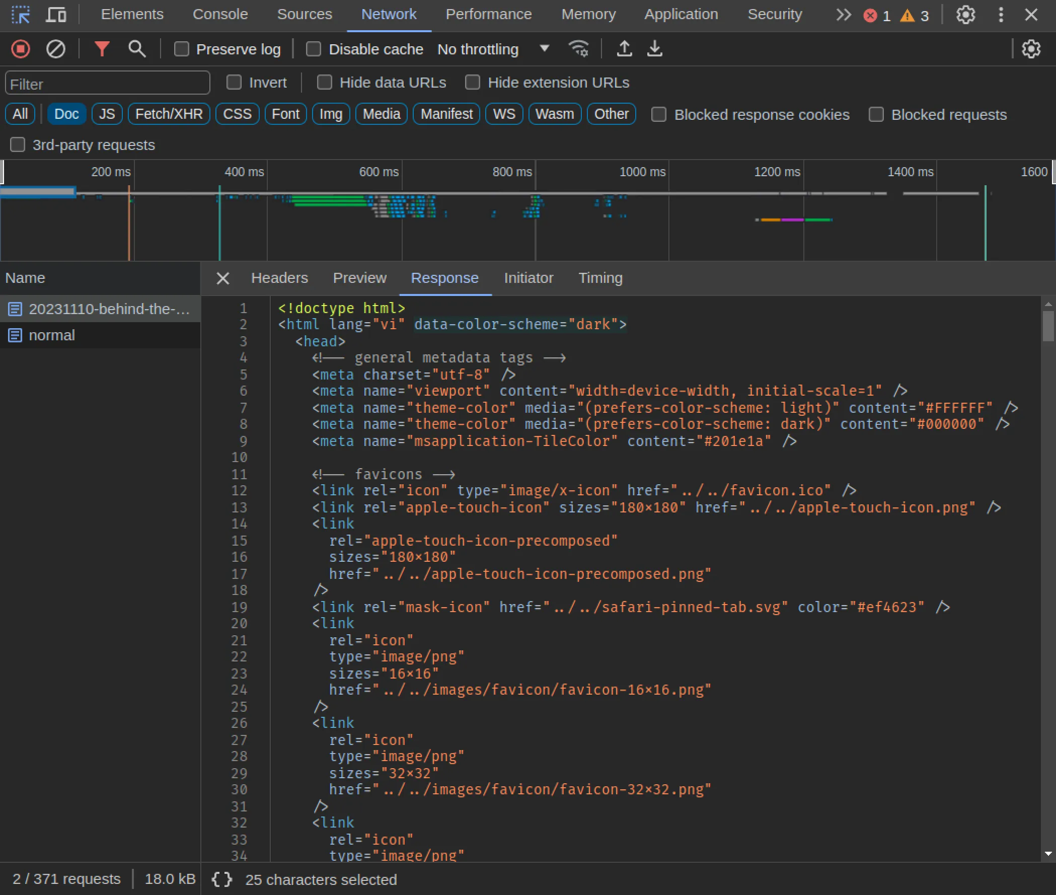
We can verify that the HTML returned from server has the correct data-color-scheme value by looking at the Network tab in Chrome Devtools right on the page you are reading:
Typescript Support
If you are using Typescript, add the following to src/app.d.ts to satisfy the type checker:
declare global {
  namespace App {
    type ColorScheme = 'light' | 'dark' | 'system';

    interface Locals {
      colorScheme: ColorScheme;
    }
  }
}Extra Credit: Accessing Color Scheme with Svelte Context
This section is optional. It discusses how we can setup a global Svelte context to check for the current color scheme (or change it) from any component in the application. You can skip over if you do not need this feature.
In the code snippet in the Setup on the Server section above, we save the value of the cookie to event.locals.colorScheme. The locals object of SvelteKit allows us to access shared states from hook.server, layout.server, or page.server.
import type { LayoutServerLoad } from './$types';

export const load: LayoutServerLoad = ({ locals }) => {
  return { colorScheme: locals.colorScheme };
};
With the above code, we can access colorScheme from the data object in +layout or +server files:
<script>
  /** @type {import('./$types).LayoutData} */
  export let data;

  console.log(data.colorScheme);
</script>
However, if we want to access colorScheme from child components, we might have to pass down a prop multiple times until we reach the desired component (children, grandchildren, great-grandchildren, …). A more elegant way is to use Svelte context, combined with store.
First, we create a separate file to define the context and the necessary logic:
import { getContext, setContext } from 'svelte';
import { derived, writable } from 'svelte/store';

import { browser } from '$app/environment';
import { PUBLIC_COOKIE_COLOR_SCHEME } from '$env/static/public';

const COLOR_SCHEME_CONTEXT_ID = 'colorscheme';

/**
 * requires `window.matchMedia` (only in browser context)
 * @returns user's color scheme preference
 */
function getPrefersColorScheme() {
  if (!browser) return 'light';
  return window.matchMedia?.('(prefers-color-scheme: dark)').matches ? 'dark' : 'light';
}

/**
 * @param {App.ColorScheme} initial
 */
function createColorSchemeStore(initial) {
  const store = writable(initial);

  const preferred = derived(store, (c) => (c === 'system' ? getPrefersColorScheme() : c));

  return {
    subscribe: store.subscribe,
    /**
     * @param {App.ColorScheme} scheme
     */
    change(scheme) {
      document.documentElement.dataset.colorScheme = scheme;
      document.cookie = `${PUBLIC_COOKIE_COLOR_SCHEME}=${scheme}; path=/; SameSite=Lax; Secure`;
      store.set(scheme);
    },
    preferred,
  };
}

/**
 * @param {App.ColorScheme} initial
 */
export function setColorSchemeContext(initial) {
  return setContext(COLOR_SCHEME_CONTEXT_ID, createColorSchemeStore(initial));
}

/**
 * @returns {ReturnType<getContext<ReturnType<typeof setColorSchemeContext>>}
 */
export function getColorSchemeContext() {
  return getContext(COLOR_SCHEME_CONTEXT_ID);
}
If you are using Typescript, refer to the equivalent source code from sveltevietnam.dev here. I will not discuss the above code in details, if you have any question or want to discuss more, be sure to reach out in our Discord!
Now, we can use setColorSchemeContext to declare the context:
<script>
  import { setColorSchemeContext } from '$lib/contexts/color-scheme';
  /** @type {import('./$types).LayoutData} */
  export let data;

  console.log(data.colorScheme);
  setColorSchemeContext(data.colorScheme);
</script>
and getColorSchemeContext for accessing the context:
<script>
  import { getColorSchemeContext } from '$lib/contexts/color-scheme';

  const colorSchemeStore = getColorSchemeContext();

  $: preferred = colorSchemeStore.preferred;
</script>
preferred will be light or dark (the ambiguous system value will be resolved two one of the two definitive modes based on prefers-color-scheme), and will be updated automatically whenever the user changes the display mode.
Effective Collaboration with Designers
The truth is, the above details are not the most complicated parts; once we understand and implement them for the first time, the next will be similar and easier. The harder part of making a dark mode, or any color system in general, is communication between designers and developers.
Each project and design team have their own conventions and standards, but the most important thing, from the perspective of a developer, is the presence of a technical voice in the design process, especially from the beginning. With my limited experience in the industry, what seems obvious to a developer is not always easy to understand for a designer, and vice versa. Collaboration between the two sides will simply help developers be able to use what designers make and avoid changes to the source code or design later down the road.
Pay special attention to your color palette. Each color should be a design token that is communicated clearly to both designers and developers. Color palette is probably the first and most important element in any design system. Organizing a color palette to be compatible with applications with dark mode is a bit more complicated than usual because each color can exist in two versions for two display modes.
At sveltevietnam.dev, we distinguish between primitive colors and semantic/contextual colors. Primitive colors are the basic colors we already know: blue, red, yellow, … Other colors will be built upon the these primitives, depending on different contexts within the application, i.e. colors for foreground or background, primary or secondary, status colors such as success, warning, error, … To learn more about our implementation with this system, visit the dedicated Colors of Svelte Vietnam page.
The sveltevietnam.dev project also uses Figma as the design tool and takes advantage of the Variable feature to represent the color palettes, which helps designers be aware of the corresponding design tokens that translate to CSS variables during the development process.
Closing
We have discussed a lot of different details and aspects of implementing dark mode in a SvelteKit application in particular, and a front-end project in general. If you are still reading, that is amazing - thank you for enduring my lengthy writing! If you have any question or comment, be sure to drop by our Discord for further discussion!
You can find the next post in the “Behind the Screen” series at ”A few secrets of sveltevietnam“.
Found a typo or need correction? Edit this page on Github