
There are three parts to the “Styling Svelte Vietnam” blog series, listed below. You are reading the last one.
In the last two parts, we have made the arguments for why TailwindCSS is a great tool for building design systems, and why CSS component is a minimal solution for packaging core UI components. In this post, we will see how to connect everything together by looking at examples from sveltevietnam.dev.
Tailwind @layer
First and foremost, we should know that TailwindCSS organizes CSS into three layers. We often see these layers in Tailwind entry file:
@tailwind base;
@tailwind components;
@tailwind utilities;baseis the lowest layer, containing common CSS rules to reset default styles for HTML elements (often referred to as “reset CSS”),componentsis where we will add CSS components, as discussed in the upcoming sections,- and finally
utilities, as the name suggests, contains popular Tailwind utilities rules such as.bg-red-500or.text-center.
Although @tailwind is a syntax specific to Tailwind, @layer is a valid CSS feature - standardized since 2022. Pay special attention to the declaration order of layers: CSS rules in a later layer can override rules in previous ones regardless of specificity. This means, for example, if we have the following CSS component .c-btn in the components layer:
@layer components {
  .c-btn {
    /* ... */
    text-align: center;
  }
}
In a particular scenario where c-btn needs to have text-align set to left, we can use the corresponding utility class in the utilities layer:
<button class="c-btn text-left"></button>Although .c-btn and .text-left selectors share the same specificity, .text-left is declared in the later layer and its text-align declaration will take precedence.
You can see that the CSS component above is prefixed with c-. This is a convention of the sveltevietnam.dev project and is not required elsewhere. However, it helps us easily identify a CSS component and provides some benefits for the editor, which we will discuss in the next section.
Declare CSS Component with @layer components
In the previous section, we have seen one way of declaring a CSS component via @layer components:
@layer components {
  .c-btn {
    text-align: center;
    background-color: theme('colors.blue.500');
    color: white;
    /* ... */
  }
}
This is probably the simplest solution and one you should start with if you are getting started with Tailwind. Its drawback is incompatibility with Tailwind language server and, in turn, editor extensions. When hovering over c-component in the markup, Tailwind extension cannot recognize c-btn like with other typical Tailwind classes.
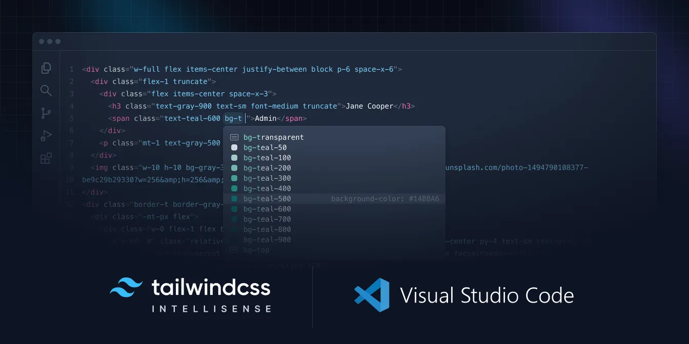
Why should we care whether a class is recognized by Tailwind language server or not? It is to enable “code discovery”, making it easy for developers to explore possible classes naturally during their daily work. One just needs to type c- and trigger intellisense for the editor to recognize or suggest appropriate Tailwind classes, including our soon-to-be-defined CSS components from our project design system. All in all, this saves time and helps minimize errors.
Declare CSS Component with Tailwind Plugin
Tailwind provides a powerful API for writing plugin. This is an effective solution if we need flexibility in configuration or compatibility with Tailwind language server. Since this API uses Javascript and exposes access to PostCSS, we can extend almost every aspect of Tailwind without being limited by CSS syntax as in the previous presented solution.
import definePlugin from 'tailwindcss/plugin';

const myplugin = definePlugin(function ({ addComponents }) {
  addComponents({
    '.c-btn': {
      textAlign: 'center',
      backgroundColor: `theme('colors.blue.500')`,
      color: 'white',
    },
  });
});

/** @type {import("tailwindcss").Config} */
export default {
	content: ['./src/**/*.{html,js,svelte,ts,md}', 'svelte.config.js'],
	plugins: [myplugin],
};
Notice that although the above tailwind.config.js is running in NodeJS context, we are using ESM syntax. Usually, this syntax requires setting up package.json with the "type": "module" property:
{
  "type": "module",
  // ...
}
ESM is becoming the standard in the NodeJS ecosystem (just as it has already been in the browser). In the following sections, we will continue to use this syntax.
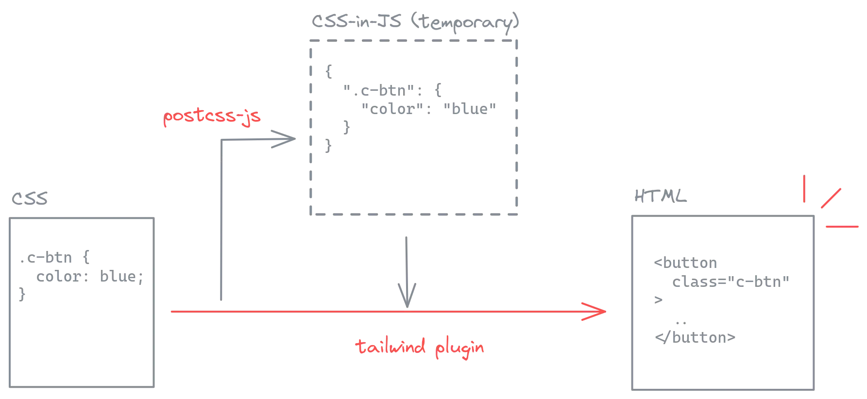
We can also use this plugin API to add to the base, utilities layers, change color palette and spacing system, or declare new variants. All of such customizations will be recognized by Tailwind language server. However, you may have already noticed that this method requires the use of “CSS-in-JS”:
addComponents({
  '.c-btn': {
    textAlign: 'center',
    backgroundColor: `theme('colors.blue.500')`,
    color: 'white',
  },
});
I am definitely not a fan of CSS-in-JS because it mixes to different syntaxes in one and takes away all the benefits of language tooling around CSS (syntax highlighting, linting). To work around this, we need to set up an intermediate step to convert CSS source code to the corresponding CSS-in-JS interface.
Convert CSS to CSS-in-JS
(1). Source code for each CSS component is placed in a separate CSS file. For example, for the c-btn component above:
.c-btn {
  /* ... */
}
(2) Use postcss and postcss-js to convert the CSS files from the previous step to the appropriate structure in Javscript:
import { readFileSync } from 'fs';
import postcss from 'postcss';
import postcssCustomSelectors from 'postcss-custom-selectors';
import postcssJs from 'postcss-js';
import postcssMixins from 'postcss-mixins';

// https://github.com/postcss/postcss-mixins
/** @type {Record<string, import('postcss-mixins').Mixin> } */
const mixins = {};

/**
 * @param {string} filename
 */
function jssLoader(filename) {
  const css = readFileSync(filename, 'utf8');
  const root = postcss.parse(css);

	// apply mixins & custom-selectors here so that
	// tailwind can pick up the correct representation for intellisense
  const jss = postcssJs.sync([postcssMixins({ mixins }), postcssCustomSelectors])(
    postcssJs.objectify(root),
  );

  return jss;
}
(3) Apply output from previous step to plugin configuration:
import definePlugin from 'tailwindcss/plugin';
import path from 'path';
import { fileURLToPath } from 'url';
import { jssLoader } from './jss-node-loader';

const __dirname = path.dirname(fileURLToPath(import.meta.url));

const myplugin = definePlugin(function ({ addComponents }) {
  addComponents({
    '.c-btn': {
      textAlign: 'center',
      backgroundColor: `theme('colors.blue.500')`,
      color: 'white',
    },
  });
  addComponents(jssLoader(path.resolve(__dirname, './c-btn.css')));
});

// ...Optimize with a Separate Build Step
So, we now have a relatively balanced solution that ensures compatibility with Tailwind language server while still allows us to write CSS components in plain old CSS. This solution is good enough for most common use cases, especially for projects with a small number of components.
However, when component count increases, developer experience will gradually degrade as the response time of build tool (Vite, for example) and language sever increases. This is due to the relatively complex and repetitive execution of file reading and processing of the jssLoader routine, triggered by file watcher or hot-module-replacement (HMR). To overcome this, we can perform jssLoader task beforehand, export it to static files, and reuse it in the plugin configuration at runtime. In other words, we will create a separate build step for CSS component.
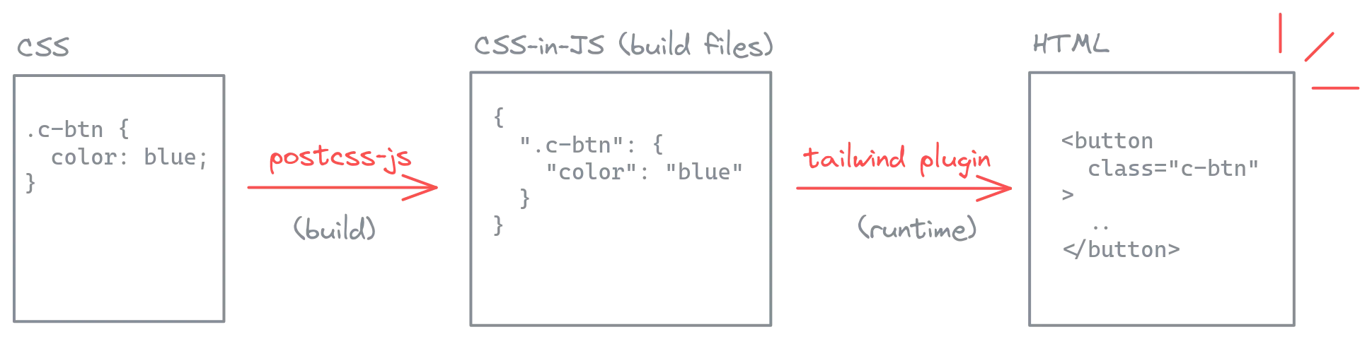
There are many ways to implement this build step. You can refer to Daisy UI source code or the sveltevietnam.dev project source code as examples. All of these solutions use the PostCSS ecosystem just as we have seen in jssLoader. Following is a simple example for such build script:
import { writeFile } from 'fs';
import { resolve, dirname } from 'path';
import { fileURLToPath } from 'url';
import { jssLoader } from './jss-node-loader';

const __dirname = dirname(fileURLToPath(import.meta.url));

const components = {
  ...jssLoader(resolve(__dirname, './c-btn.css')),
  ...jssLoader(resolve(__dirname, './c-input.css')),
  // ...jssLoader(resolve(__dirname, './c-*.css')),
};

writeFile(
	resolve(__dirname, './components.dist.json'),
	JSON.stringify(components),
	'utf-8',
	(e) => {
		if (e) console.error(e);
	},
);
We can also set up a dedicated npm script for it:
{
  // ...
  "scripts": {
    "build:css": "node ./build.js",
  },
  // ...
}
And finally use the output in plugin configuration:
import definePlugin from 'tailwindcss/plugin';
import path from 'path';
import { fileURLToPath } from 'url';
import { jssLoader } from './jss-node-loader';

const __dirname = path.dirname(fileURLToPath(import.meta.url));
import components from './components.dist.json';

const myplugin = definePlugin(function ({ addComponents }) {
  addComponents(jssLoader(path.resolve(__dirname, './c-btn.css')));
  addComponents(components);
});

// ...
As discussed, a separate build step helps improve response time during development. We cannot ignore, however, the fact that it also adds to complexity. Start without a build step, then only refactor if the project has grown to need one. The following characteristics are good indicators to know when a build step is necessary:
- dev server takes more than three seconds to response each time you change code related to Tailwind configuration,
- your design system is complete and does not need much change,
- you need to package your design system and components to reuse in other projects.
Packaging for Reusability
For me, the best benefit of using Tailwind plugin API is its independence from other parts of the application, making it easy to package the design system to reuse in other projects sharing the same design tokens or components.
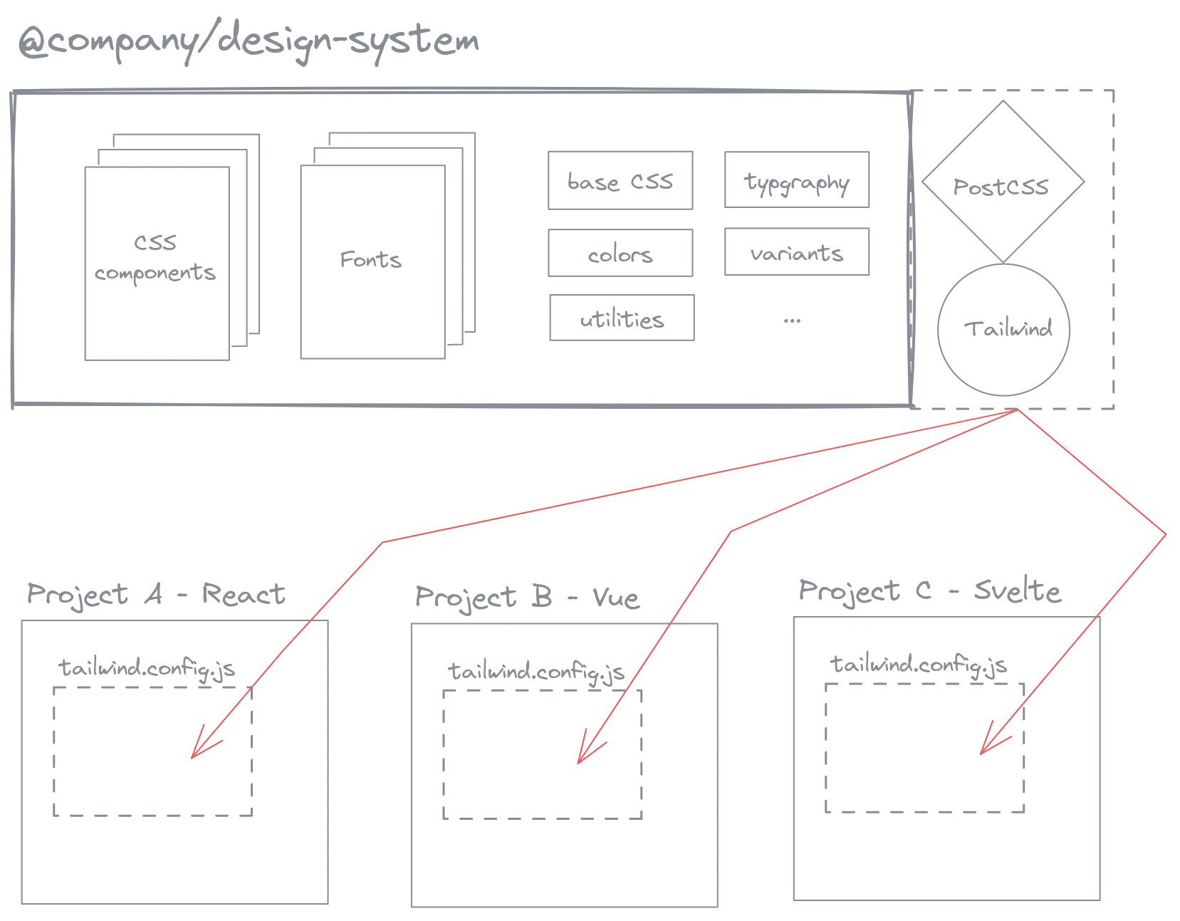
Design system built this way is just simple abstractions on top of vanilla CSS and Javasrcipt; we can use them in many different contexts or frameworks as long as PostCSS and Tailwind are supported. In advanced use cases, we can also integrate our Tailwind plugin into existing UI libraries containing Javascript components, depending on the requirements and framework you are using.
import { Header, Footer, ArticleCard } from '@company/design-system/svelte';
import { Playground } from '@company/design-system/react';
// ...
Implementation details for packaging is beyond the scope of this blog post. If you have worked in a monorepo with internal libraries or published a library to npm before, the process here is mostly the same. You can also refer to the source code of @sveltevietnam/ui - the packaged design system of sveltevietnam.dev, implemented using the concepts we discussed in this blog series.
Closing the Series
Throughout three parts of the “Styling Svelte Vietnam” blog series, I have introduced the reasons and how the sveltevietnam.dev project uses TailwindCSS, combined with a “CSS component” approach to build minimal design system that allows simple packaging and reusability while also enables code discovery and an overall improved developer experience.
I hope this post has been a helpful peek into the internal design and implementation of sveltevietnam.dev, as well as a source of reference and ideas applicable to your own projects. The design system of sveltevietnam.dev is not perfect and will continue to change and improve over time, much as the implementation details discussed here may become outdated with the fast pace of technology today. The core concepts, however, will always be valuable.
For further discussion on this topic, you can join the Svelte Vietnam Discord. Thank you for reading!
Found a typo or need correction? Edit this page on Github